Showing posts with label SBCVC2. Show all posts

20110113

Browser-friendly Websites

Making sure that you build a website that is going to look the same in various browsers in critical to any website design.

Here are the latest statistics for the usage of different browsers:


This factor will play a large role in the design choices I make for my website. Throughout the Dreamweaver sessions I will be constantly testing my website in multiple browsers. There are 3 main problems:
  • The visitors operating system
  • The visitors display system
  • How the browser interprets the page
The visitors OS will affect how the scroll bars, arrows, submit buttons and navigational buttons would look for example. There is coding to personalise even these small bits of detail but many websites leave it.

The visitors display system will focus mainly on the resolution of the screen that the visitor is using. You cannot take for granted that everyone will be operating from monitors with a resolution of 1024x768 (highest res.) This plays a huge part in the dynamics of your website and where there will be scrollers put in unintentionally.



20110112

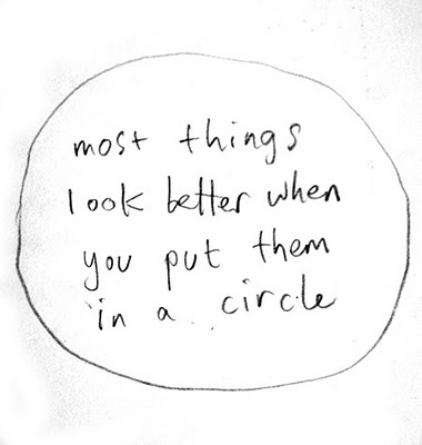
Everything Looks Better..


I am a strong believer in this little bit of philosophy. I love the circular shape, I think that it solves many problems subconsciously. I feel that people will feel more inclined to click on a shape instead of a word. It is a friendly shape that everyone can relate to. I feel that putting the words of my links inside the circular shapes instead of just having my words will hold the viewers attention a lot more.

From my initial ideas, I demonstrated my idea to have icons that scroll like apple mac icons but for a first website, and to make sure that my site carries a depth of continuity, I decided against this idea. But I would still like to use the circular shape that the icons appear as. 

The birth of Irrelevant Supremacy

It is an idea I have had for quite some time now but had never done anything about, until I began a blog last year and named it this. But there are many visual ideas that I have to take this forward with, so I wanted to name my website the same thing, to help get it recognised and get people involved hopefully.
A few ideas for colours and fonts for my website:


20101203

Index page for website

Yesterday I bought a domain and web space from siteground.com. £38 for the year, I thought was reasonable. MY thought processes for my designing of my web page is well under way, with my lastest idea being the one I am excited about the most..


The icons are eye grabbing and will help in keeping the attention of the viewer. There will be a 3-4 second video beofre this still shot, where I appear out of focus then gradually come into focus. As I open my hands up in this fashion, these icons will appear, and very much like the apple icons, they will magnify when the cursor rolls over them. The links (in order from left to right) are music, contact details, bio, work and photography. The three icons that are at the base of my page are external links to relevant pages of mine- (from left to right) Soundcloud, Facebook and my design blog.